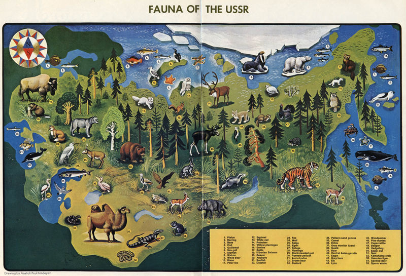
To avoid appearing American-centric, here’s a map of the USSR’s wildlife from 1972. A decade or two after the USA wildlife map I posted a couple weeks ago, this USSR map comes from the pages of Soviet Life Magazine (see also) . It shouldn’t be surprising, but the similarity to our American wildlife is readily visible. Both countries cover similar climates, span comparably mountainous, arid, wet, warm, and cold areas, and were (geologically speaking) connected not too long ago. It shouldn’t be a shock to find deer, moose, bears, badgers, and so forth. There’s a few asia-centric critters here, such as monitor lizards, camels, and tigers, but compared to our mountain lions, alligators, and turkeys we locals tend to forget that rather exotic creatures live in our backyards. The USSR map seems to have far fewer critters than the US, but that accounts for American excessiveness: the US map has a lot of repetition; look around the edge of the map for a more accurate count, and we’d be about the same if it weren’t for all the different bird variants on the US map.
Category: Uncategorized
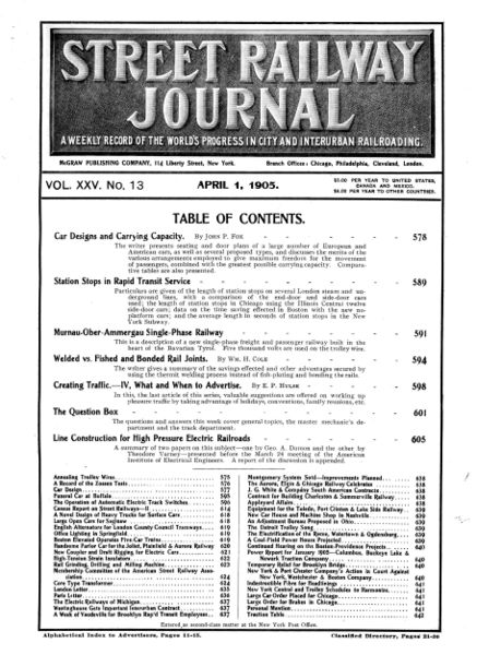 On April 1 1905, railwaymen around the world were pleased to find this issue of Street Railway Journal waiting for them. The magazine contains news and photos regarding municipal electric railways, such as trolleycars — none of that high-falootin’ long-distance steam railroading here!
Industry magazines have been a moneymaker for quite some time; their market is niche, they can quickly provide demographics for advertisers, and since they’re quite often free, they’re guaranteed to get into the hands of the people advertisers want to see it. You can get free industry magazines, too: I get emailed offers all the time, because I signed up for one, and now they’ve got me. Stuff on chemical processing, digital-optical equipment, modern quality control processes, and internet technology. Those are today’s hot, up-and-coming technologies: in 1905, the world of short-line railroads was The Future. You may not realize it, but the industry is still around: subways, the El, metro light transit, they’re all evolved from the electric urban trolleycars of 1905. Following the progression of technology, the Street Railway Journal joined with the Electric Railway Review to become the Electric Railway Journal in 1908, and then the Transit Journal in 1932.
Where’s the rest of the magazine? I’m in the process of scanning it; it’ll be available here, and via LuLu like the Fallout Shelter booklet.
Changing A Model T Tube
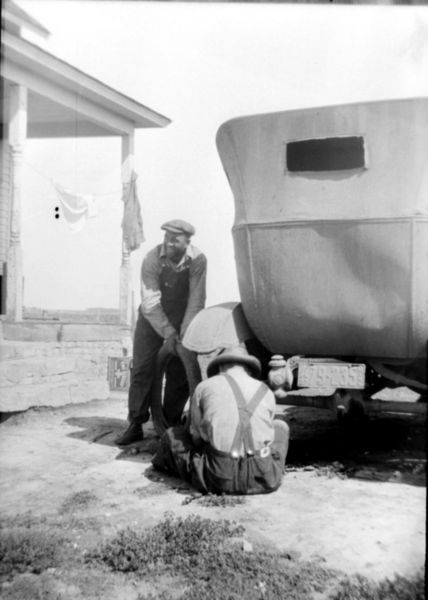 What we see here is the hindquarters of a mid-1920s Model T Sedan. The first clue is the license plate, issued in 1927, but the dented-up body would indicate that the car isn’t right off the showroom floor. Aside from the year, it’s pretty clearly the Ford T Sedan: the fabric top, the under-scooping back end, the fenders all echo the Model Ts of the day.
In the 1920s, you had to pull the tire off the rim on a regular basis, for the same reason modern bicyclists are skilled at the same task. Car tires of the day had an inner tube, which had a habit of bursting from time to time. It was far more common in the cars than in bicycles, as the Ts covered more land, were heavier, and hit things at faster speeds than a bike. Travelers without a spare tube were in for a tough time. When you’re on a cow-trail road, five miles from anywhere, no phone, no nothing, you had to fend for yourself. These guys were in luck: they were close to a house, and probably the advantage of a full toolkit from the farm’s shop. They both also look familiar with the process, and probably had it done lickety-split.
A sidenote on the Model T itself: As these photos are from Western Minnesota, this car was probably assembled, by hand, at the Ford Manufacturing Plant in Fargo, North Dakota. In the 1910s, Ford’s expanding influence meant that they could no longer economically manufacture cars in Detroit and ship them by rail — assembly plants were built all around the nation 1914, building cars for their local region. Fargo’s opened in 1914 and was going full-steam by the time the car above was sent out into the Red River Valley’s prairie farmland.
The Racecar of Typewriters
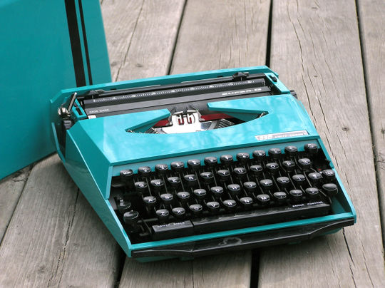 In 1970, two prominent companies within their respective industries came together to produce the item on the right. Smith Corona had been producing typewriters and other office equipment since the 19th century. Ghia Design was changing the European automobile design world by creating speedy shapes for manufacturers, most notably the Karmann Ghia. The “Super-G” wasn’t revolutionary in its interior; the mechanics were standard portable-typewriter parts seen in numerous other SCM models. The most notable design features are on the closed-case cover: striking, vibrant colors (turquoise or orange), a racing stripe, and the Ghia logo. I initially thought that Smith-Corona may have simply licensed the Ghia name, but the bold “DESIGN BY” in the logo seems to verify that some designer in need of a pet project was taken away from cars and handed a typewriter design handbook. There is a bit of a disconnect between the interior and the exterior of the typewriter. The cover has straight, speedy lines with softly rounded corners, much as you’d find on a car. The interior, however, exhibits the sharp modernism that was approaching through the 1970s and 80s. One might equate it with the Ghia concept cars that followed shortly thereafter.
In the coming years, Ghia was bought by Ford, and Smith Corona found that mechanical office equipment was ending up in the landfills. Ghia still makes cars, but rebranded Ford models; Smith Corona still puts text to paper, but in a more computerized way. For a short time, however, the unlikely pair managed to make the nearing-obsolete typewriter technology look like it could hold it’s own in the Grand Prix.
Little Eddie Schafer and His Dad
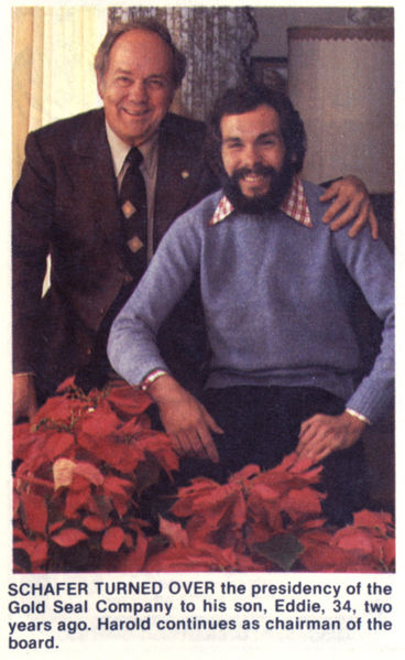 “Eddie” over there on the right, has a tough road ahead of him — despite his shaggy appearance and obese lapels, he’s got big shoes to fill. His dad, a prominent North Dakota businessman, had appointed Eddie to be his successor in taking over the family business. How do you think Eddie did? Would a guy named “Eddie” ever do well in any career other than car sales or running a pawn shop?
As president of Gold Seal, Eddie was in charge of the Mr. Bubble fortune, but it didn’t take long to drop the childish suffix. Harold Schafer’s son, now just “Ed Schafer”, went on to be North Dakota’s governor for most of the nineties — only 11 years after this photo was taken. He remained politically active after his term, and just recently George W Bush appointed Schafer to the position of Secretary of Agriculture. Here, have a look at Eddie today: he’s come a long way from a goofy smile and gingham dress-shirts.
Perry Como’s Wanted Poster
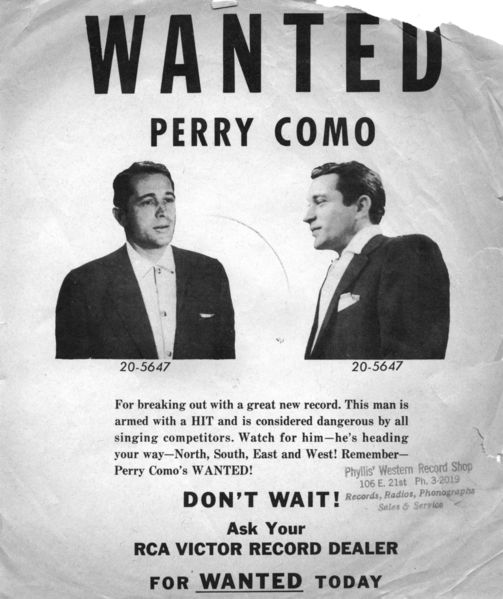
In 1954, Perry Como released “Wanted” on a 10-inch 78, with “Look Out Your Window” as the B-side; both went up in the charts quickly with Wanted hitting #1. Despite Como being in the prime of his career, RCA made sure the word got out and released this promotional flyer, perfect size for slipping in the 10″ record sleeve of Como’s other albums. Como is accused of the horrendous crime of ‘breaking out with a great new record’ — something ‘dangerous [to] all singing competitors’! Accusing the white-bread, good-natured Como of a crime was a playful turn, but a bit different from the song: Wanted‘s lyrics addresses a woman’s criminal act of finding her way into another man’s arms. It seems everyone was engaging in criminal activities! The final line of Como’s crimes uses a apostrophe pun. It could mean, depending on whether the apostophe is a contraction or a possessive, either “Remember — Perry Como is Wanted”, or “Remember Wanted, by Perry Como.” That number under Como’s name? It looks like it could be the number off his jailhouse uniform…but it is, in fact, RCA’s catalog number for the Wanted record.
As a sidenote, I tried to track down Phyllis and her Western Record Shop. Sadly, I have no way of knowing where she was located. I got this flyer exactly how it was intended — stuffed in a 78 of one of Como’s other early-fifties albums — but it was purchased from a travelling Texan antique show dealer, so Phyllis could have been dealing in phonographs anywhere from here to Amarillo.
Angelo’s Atom Bomb
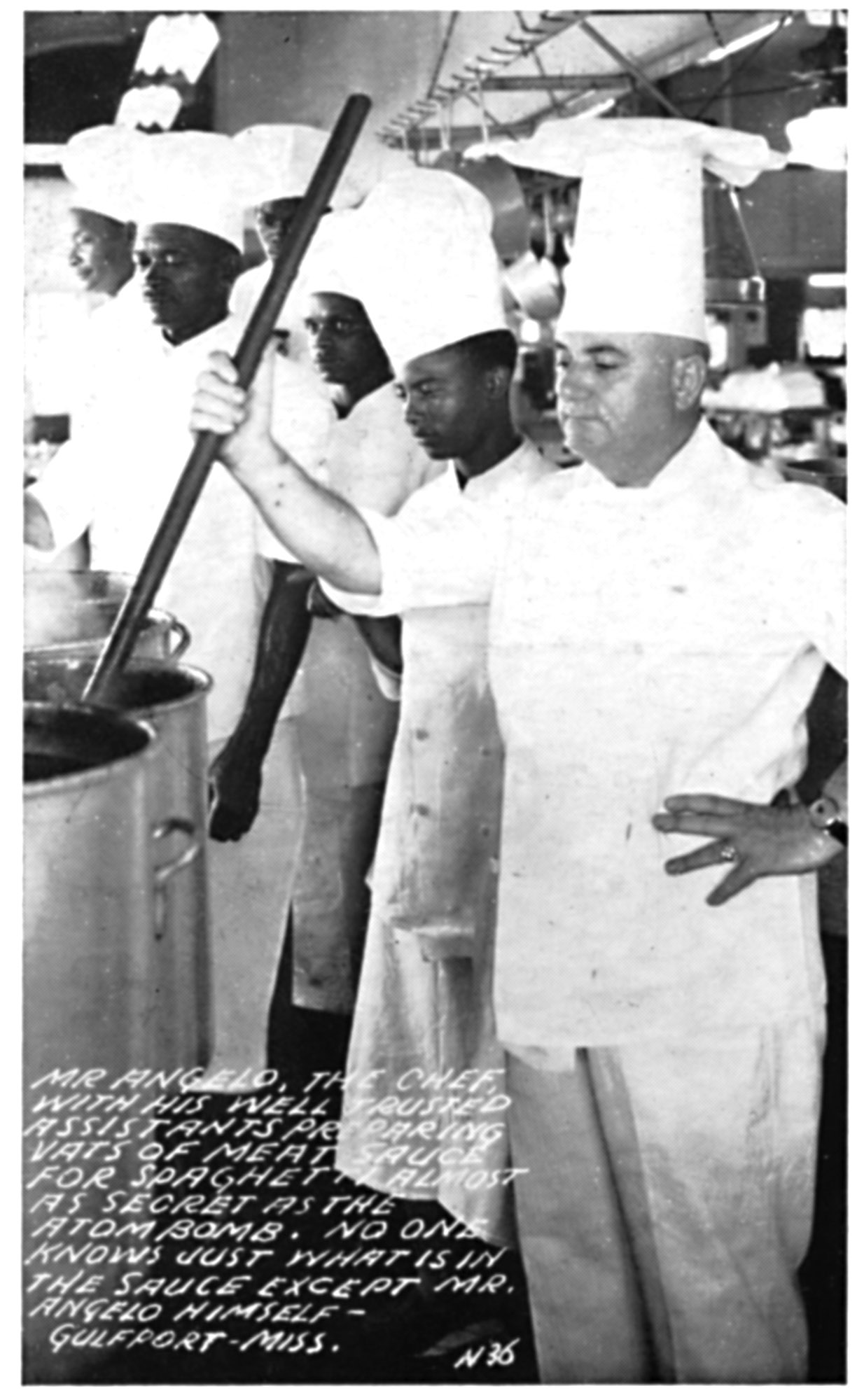 We’ve met Angelo before, a young immigrant who made himself a celebrity chef in the 1930s. In this postcard, a Mr. has been added as a sign of professional respect, but also in a style my wife has seen used in Greek restaurants — “Mr” being formal, but the use of the first name being more casual and inviting from someone whose food you trust enough to eat.
By the time this postcard was created, his fame and power had reached a world-shattering degree: the caption states that his recipe for spaghetti meat-sauce was “almost as secret as the atom bomb.” Note that it doesn’t use the Bomb as a comparison for quality of strength (although I’m sure, in modern terms, it was ‘da bomb’), but instead comparing to the secret. This helps place the age of the post card a bit better: I’d previously figured this was 1940s, and since the postcard alludes that the atom bomb (first tested in 1945) was still considered a hidden secret known to only the U.S., this postcard may be from as late as 1950 but probably not much after.
I also must remark (probably in the naivetie of a Northerner) that I am impressed both postcards show Angelo’s staff to be composed entirely of Black chefs. While they’re referred to as ‘assistants,’ in the cooking world where the chef whose name is on the sign over the door is par to a king in a restaurant kitchen it’s still quite a title. For his assistants be used as a key portion of the restaurant’s advertising, both in the photo and referenced in the text on both cards, must show Angelo saw the importance of his staff both in the kitchen and to the rest of the world, rather than devaluing them as just the negro help.
Bud’s Chicken Take-Out
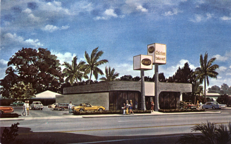
Bud’s, according to their website, has been in the takeout business since 1957, slingin’ food from one location until 1976. This postcard, I believe, is that second location — it’s not a photo, but an artist’s rendering: those people look a bit too mannequinny for to be real, copied right out of Entourage. The design is very seventies, composed of futuristic curves, floor-to-ceiling windows, and smooth lines, combined with the ecologically-friendly wood shingles and lots of plants in the decor. The signs mimic the palm trees in the background, rooted trunks sprouting from the ground and narrowing towards the top, but terminating in huge, mostly-empty cubes proclaiming the product available.
According to the back, this location sprouted up at the corner of Worthmore and North Dixie Highway, catering to the “tremendous population growth” in South Florida. Bud’s has grown to seven locations, but they’re not at 2200 N Dixie anymore…that location has become a Dunkin’ Donuts.
Bob, Flipo, and Elmer
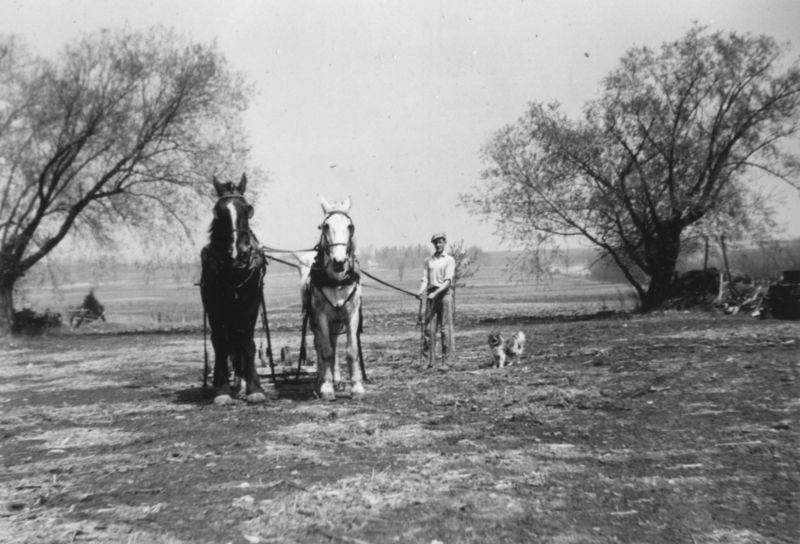 This photo was titled, “Bob, Flipo, and Elmer.” However, we’ve got four entities in the photo: Two horses, a man, and a dog. So, who’s who? Elsewhere in the album, we’ve met an “Elm“, which is probably short for Elmer, and a Brownie, that looks a bit like this dog. So, that means the horses are named “Bob” and “Flipo.” What are Bob and Flipo doing? It looks like they’re hitched to a drag of some sort, scraping the surface of the ground to turn the turf under and either prepare it for planting, or just turn the weeds under so they don’t become too unmanageable.
Easter In the 1920s
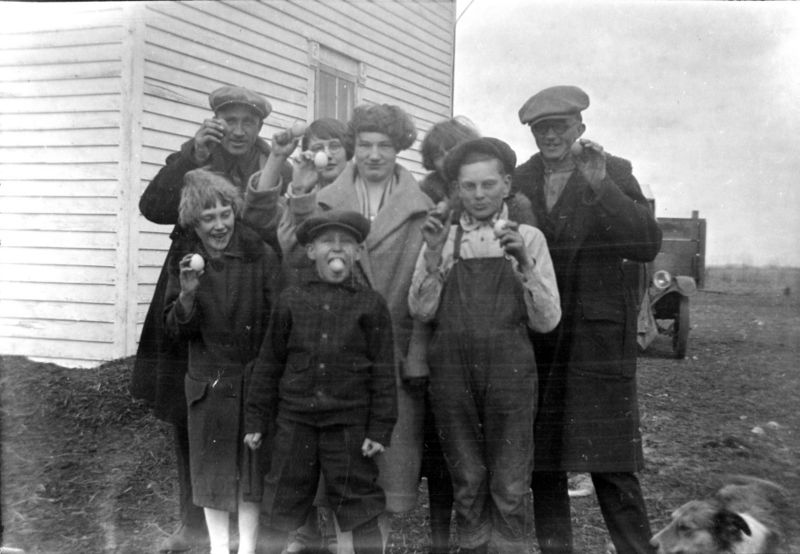
The 1920s send their wishes you a Happy Easter! In this photo, younger versions of the people seen in the Minnesota photo negative set show their Easter morning discoveries. I just hope nobody bumps that kid in the middle too hard.