 |

| |
|
|  |
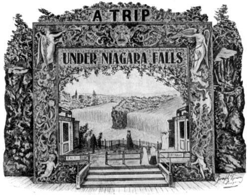
Niagara Falls Ride, 1905.

Click for full image You might think Disney invented immersive amusement park rides, but he was a latecomer to the game. As trolley car services grew in cities, they looked for ways to expand ridership. One popular solution: buy land towards the end of the line, and build an amusement park. You can't count on short-line railroad entrepeneurs to also be experts in weekend frivolities, so they had to get their attractions from somebody, and possibly a creative genius like Joseph Turner. Turner operated his New York business on the premise that the people of Kansas City would love the chance to visit Niagara Falls, complete with synthetic wind, water, and Native American legends. Read the entire ad here. Labels: 1900s, 1905, advertisement, amusement park
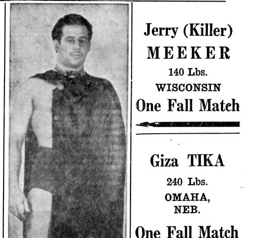
Jerry "Killer" Meeker, 1945.
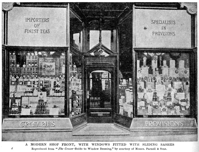
Sash-Windowed Storefront, 1890s
 Caption reads, " A modern shop front, with windows fitted with sliding sashes." The 'sashes' are the front two large-paned windows facing the street (the grips are visible along the bottom edge of the window). The sash is fitted with a sash-weight to counteract the enormous weight of a sheet of glass this size. The sash slides upward to open, allowing street-side sale of groceries during times when the weather allows and closing up during inclement weather. Labels: advertisement, Harmsworth Self-Educator, retail
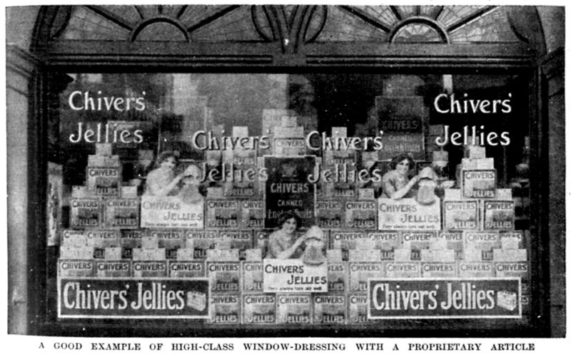
Chivers' Jellies Window Display, 1890s
 The caption reads, A good example of high-class window dressing with a proprietary article. That proprietary article is Chivers' Jelly, preserves from a UK company that still happens to be around — albeit now part of an international conglomeration and located in Ireland. Labels: 1890s, advertisement, chivers' jellies, england
Travelling By Corvair
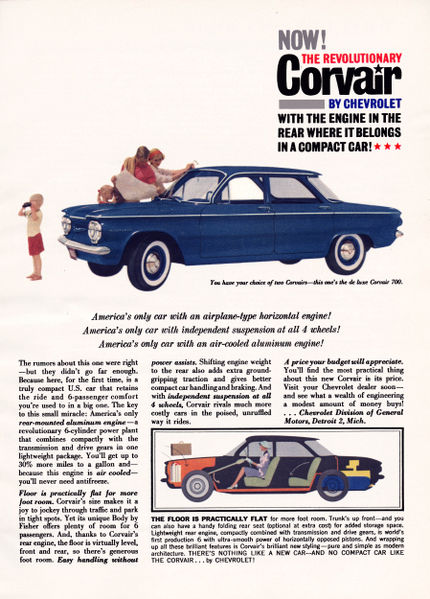
 America's only car with an airplane-type horizontal engine!America's only car with an independent suspension at all 4 wheels!America's only car with an air-cooled aluminum engine!This ad for Chevrolet's Corvair America's only car with an airplane-type horizontal engine!America's only car with an independent suspension at all 4 wheels!America's only car with an air-cooled aluminum engine!This ad for Chevrolet's Corvair from 1959 shows just how advanced the little car was -- largely inspired by the Volkswagen, the Corvair put an ample air-cooled engine inside a compact body (although a bit larger than a VW), and championed it as the low-cost car of the future. Compare to the Corvair's contemporaries of the late 1950s: big steel behemoths with cast-iron monstrous engines up front where they belong. The Corvair's competition was almost entirely European imports like the VW, Volvo, and Porche, so Chevrolet was carving a new market for their vehicles, feeding American steel to the customers in need of a good 'ol American machine, and something small and efficient for people looking for something more manageable. The Corvair, as Mr. Nader will gladly tell you, was a victim of its advanced design -- that fancy suspension in the ad was prone to causing catastrophic accidents, and the rear-weighty engine location caused steering issues for drivers. Deaths, sadly, result in distrust for the new technology, and despite a much-too-late redesign with the '64 models by '69 the car was done. Rear-engines in American cars never really went far; the Corvair was one of the last, although Pontiac (who had also tried a rear-engine with their Polaris prototype) went with a mid-engine in the Fiero, and Pontiac's ex-designer John DeLorean put a rear engine in his DMC 12. Labels: 1950s, 1959, advertisement, automobilia, chevrolet, corvair
Perry Como's Wanted Poster
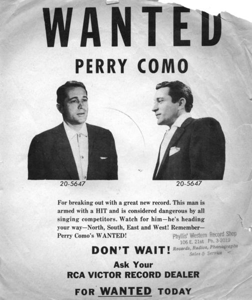
 In 1954, Perry Como released " Wanted" on a 10-inch 78, with " Look Out Your Window" as the B-side; both went up in the charts quickly with Wanted hitting #1. Despite Como being in the prime of his career, RCA made sure the word got out and released this promotional flyer, perfect size for slipping in the 10" record sleeve of Como's other albums. Como is accused of the horrendous crime of 'breaking out with a great new record' -- something 'dangerous [to] all singing competitors'! Accusing the white-bread, good-natured Como of a crime was a playful turn, but a bit different from the song: Wanted's lyrics addresses a woman's criminal act of finding her way into another man's arms. It seems everyone was engaging in criminal activities! The final line of Como's crimes uses a apostrophe pun. It could mean, depending on whether the apostophe is a contraction or a possessive, either "Remember -- Perry Como is Wanted", or "Remember Wanted, by Perry Como." That number under Como's name? It looks like it could be the number off his jailhouse uniform...but it is, in fact, RCA's catalog number for the Wanted record. As a sidenote, I tried to track down Phyllis and her Western Record Shop. Sadly, I have no way of knowing where she was located. I got this flyer exactly how it was intended -- stuffed in a 78 of one of Como's other early-fifties albums -- but it was purchased from a travelling Texan antique show dealer, so Phyllis could have been dealing in phonographs anywhere from here to Amarillo. Labels: 1950s, 1954, advertisement, perry como, record album
The Hideout at the Comstock
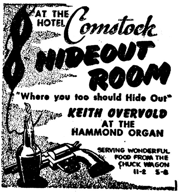
 This This came from a 1955 Moorhead Daily News, advertising the Comstock Hotel's Hideout Room. This appears to have been the hotel's lounge, featuring the dulcet tones of the Hammond organ. The Comstock was located in downtown Moorhead until Urban Renewal flattened and re-drew the flood-ravaged section of downtown to build a mall- wrapped- around- city- hall monolithic building that's struggled to keep shoppers and tenants. Personally, I prefer how the Comstock looked to the ultramodern styles of the buildings built in its place. Labels: 1950s, 1955, advertisement, comstock hotel, minnesota history, moorhead
J. D. Muldowney and Bro's Kitty Chorus
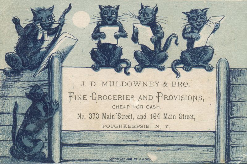
 It's sad when something doesn't come up in Google whatsoever. J. D. Muldowney & Bro. - nothing. Neither address brings anything up. 164 Main looks like a parking lot now on Google Maps, but 373 could still be an old building. Not even the illustrator, J. H. Ives, shows up in search results. So, this little advertising card holds a bunch of mysterious info, guarded by a chorus of partially-anthropomorphized kitties. It's printed on a stiff card, not as thick as a postcard but thicker than paper, and it looks like it may have been gummed. Labels: 1880s, advertisement, cats, illustration
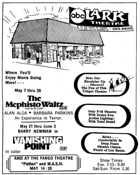
Lark movie theatre ad, 1970s.
 The Lark occupies the corner of Roberts Street and 1st Avenue in Fargo, one of the strange on-stilts buildings in Fargo designed to maximise parking space. The last time I was in the Lark was the Cinema Grill auction. The building had been vacant through the 1980s, but in the 90s a company reopened it as a dinner-movie-theatre. I'd seen one movie there, but that was it -- the films appeared to be VHS projections, as opposed to actual film, and the lights were up enough so you could read menus, which made the screen harder to see. The food-film experiment ended in the late 90s, and a Christian church of odd repute (when I was at the auction, the church's leader spent some time telling me how 9/11 was predicted in Scripture) held services in it, and I believe is still occupying the building. There had been rumours of that block being razed to build a sports arena -- a very bad idea in my mind -- but that's my guess as to why the Lark is still there., waiting for a developer to come along. The ad was from a Binford Guide. Labels: abc, advertisement, downtown fargo, lark, movie theatre, theatre
|  |
|
|
