 |

| |
|
|  |
Horsing Around in the 1930s
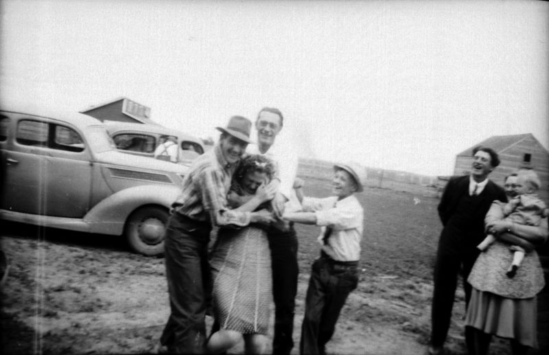 This image was poorly exposed and blurry This image was poorly exposed and blurry; I had to squeek out as much as I could using Photoshop -- I'll bet the young lady being tortured in this photo was happy to see that this photo didn't turn out originally...but she had no idea that 70 years later somebody on a computerized internet would blog about it (I'm not sure she could even parse that last phrase.) I personally love the unposed, candid photos like this one: look at what has been tossed out because it was unfit for photo albums; today is even worse, when you can completely delete an image, permanently, without thinking twice. People who stick to stiffly posed photos are missing out on the vibrant art that can come from an unplanned, quick and dirty photo. The photo above has so much going on in it -- the wrestling in the foreground, and what are they stealing from her? The friendly grouping on the far right, who look like they might otherwise not be photographed as in that same grouping because there's no logical reason to do so. The guy hunched over in the distance, leaning inside an open car door. When people are posed in a stiff, unlively manner, something is lost -- I'll bet Bertha was a far more fun person than this photo would lead the casual viewer to believe. Labels: candid, minnesota history, vintage photo, wrestling
Enid Brant, Scrapbooked
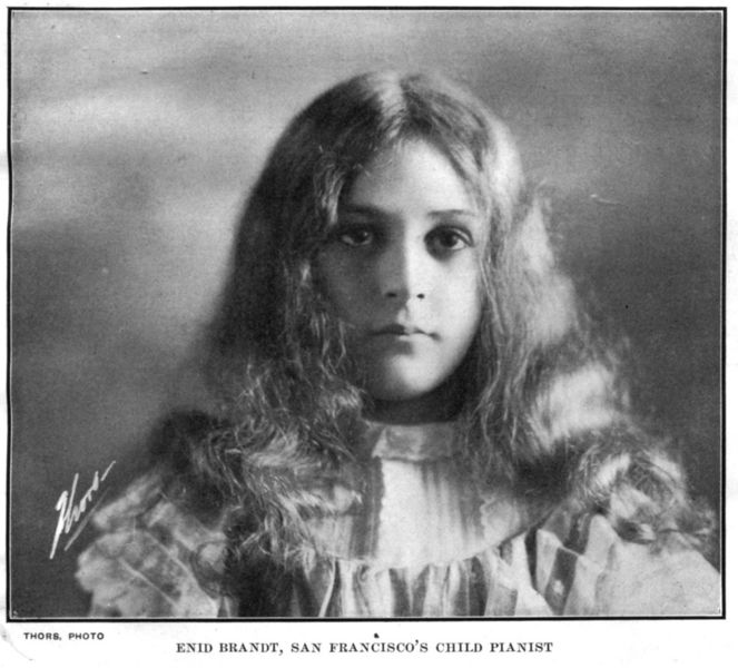
 All we have to go on is her caption: Enid Brandt, San Francisco's Child Pianist. Her photo comes from the Pennsylvania Report Scrapbook, what we'd consider 'altered art' today. The book was originally the " Pennsylvania Report of the Superintendent of Public Instruction, 1895," but an industrious photo-lover cut photos out of magazines and glued them over the top of the less-than-interesting education statistics. Most photos appear to be from glossy magazines of the time, and they all seem to range in the 1900-1905 range, based on photos of politicians and other places. One thing missing from the scrapbook, despite the amount of California photos? The San Francisco Earthquake of 1906. Enid doesn't appear in Google as growing into a prodigy and master of her instrument; I hope the talented young lady made it through the quake and fire. Labels: 1900s, enid brandt, pennsylvania report scrapbook, pianist, san francisco, vintage photo
Arrangement in Gray and Black: Melby's Mother
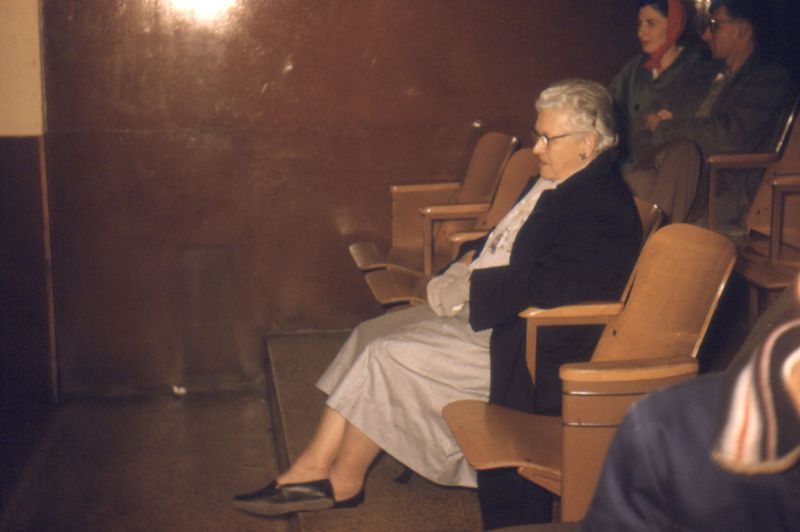
 Whistler's Mother Whistler's Mother (otherwise known as Arrangement in Gray and Black No. 1) is an iconic image in our culture, recalling a Victorian silence and respectability. Mrs. Melby's Mother, above, spent Halloween 1960 at a bowling alley. My, how times change is a little less than a century! Not quite as much as you may think, though -- the style of dress is similarly modest, although Mrs. Melby has gone stocking-free and is showing a little ankle. Her chair is similarly spartan, although anyone who attended a high school built earlier than 1960 is probably intimately familiar with such folding seats; many a small finger has been bit by those steel hinges while screwing around during an oh-so-important school assembly in the auditorium. Labels: 1960, 1960s, bowling, minnesota, vintage photo
Trompe l'Oeil At The Pfister
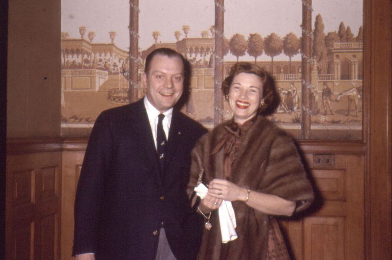
 Say 'hi' to Larry & Ruth Smith, frequenters of the Pfister Hotel. This was taken in February 1957, along with several other photos I've uploaded. This photo has the best view of the trompe l'oeil wallpaper in the Pfister. A different wallpaper is visible in other photos, but this the best view of any of them. And it is wallpaper - you can see the seam just over the lady's right shoulder, and note how the wall in the distance doesn't line up between. The wallpaper artist used the ivy-wrapped columns to both hide the seam and create a 'break' to obscure varying views put side-by-side; my guess is that this paper (probably spendy) was sold with numerous vignettes, intended to be randomly juxtaposed for a more natural look. It was designed to be applied with a wainscoting, to leave the view appropriately at eye-level, and was probably quite expensive at the time. The Pfister was a classy place, though -- it was worth it. Labels: 1950s, 1957, fur coat, pfister hotel, trompe l'oeil, vintage photo, wallpaper
Claiming Her Own Nickname
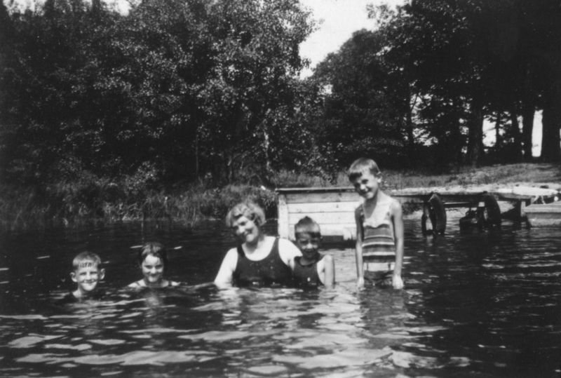
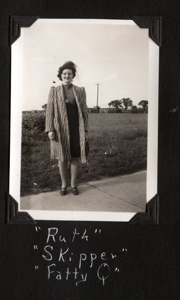
 Here, to the right Here, to the right, is Ruth. She once had a photo album of her life in the late 1930s, which I've started scanning recently. On the second page of the album, she has a series of captioned photos captioned as a dramatis personae, identifying the players in her life. Her self-portrait includes several nicknames -- "Fatty Q" being one of them. While not the lithest of ingenues, Ruth isn't obese, so that might be why she's accepted the nickname without offense. The nickname of 'Skipper' is interesting, too. The two things we associate 'skipper' with -- the fat guy on Gilligan's Island, and Barbie's sister -- were decades away from Ruth's life. Captaining a boat was the main definition, although 'one who skips' could mean she either has a slight jump in her step, or maybe she prefers to avoid going to class. Either way, Ruth has two 1930s nicknames that she was proud enough to own to save it for her kids to see: I hope she was still as proud of them years later. Labels: 1930s, 1938, vintage photo, wisconsin history
Scenic California
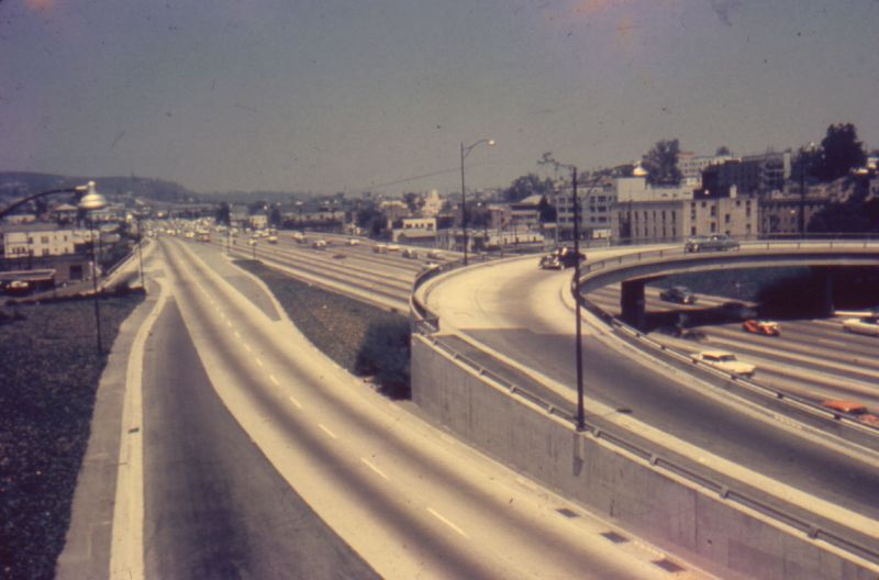
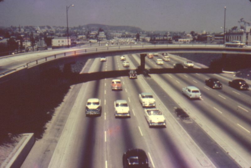
 I know I've been picking on North Dakota for its scenic vastness, but is this so much better? Back in the 1960s, California was so proud of its freeway system that -- like Arizona with its Grand Canyon, South Dakota with its Mount Rushmore, New York with its Niagara Falls -- they released a set of collectible slides documenting the Los Angeles Freeway System. MARVEL at the expanses of concrete and pavement! SMELL the pollution wafting up from the vehicles! CRINGE IN TERROR at how close those two cars are in the third lane from the left! Oh, I kid -- unlike where I live, you can actually see some hills off towards the horizon. Between here and there, however, is a concrete jungle. I still prefer here. see also: pre-freeway map * California highways * more photos * just newer cars today * house stranded on CA highwayLabels: 1960s, california history, freeway, highway, vintage photo
|  |
|
|
 This image was poorly exposed and blurry; I had to squeek out as much as I could using Photoshop -- I'll bet the young lady being tortured in this photo was happy to see that this photo didn't turn out originally...but she had no idea that 70 years later somebody on a computerized internet would blog about it (I'm not sure she could even parse that last phrase.) I personally love the unposed, candid photos like this one: look at what has been tossed out because it was unfit for photo albums; today is even worse, when you can completely delete an image, permanently, without thinking twice. People who stick to stiffly posed photos are missing out on the vibrant art that can come from an unplanned, quick and dirty photo. The photo above has so much going on in it -- the wrestling in the foreground, and what are they stealing from her? The friendly grouping on the far right, who look like they might otherwise not be photographed as in that same grouping because there's no logical reason to do so. The guy hunched over in the distance, leaning inside an open car door. When people are posed in a stiff, unlively manner, something is lost -- I'll bet Bertha was a far more fun person than this photo would lead the casual viewer to believe.


