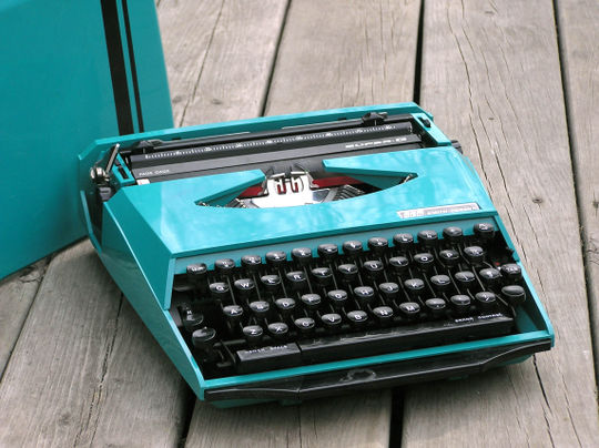
 In 1970, two prominent companies within their respective industries came together to produce the item on the right. Smith Corona had been producing typewriters and other office equipment since the 19th century. Ghia Design was changing the European automobile design world by creating speedy shapes for manufacturers, most notably the Karmann Ghia. The “Super-G” wasn’t revolutionary in its interior; the mechanics were standard portable-typewriter parts seen in numerous other SCM models. The most notable design features are on the closed-case cover: striking, vibrant colors (turquoise or orange), a racing stripe, and the Ghia logo. I initially thought that Smith-Corona may have simply licensed the Ghia name, but the bold “DESIGN BY” in the logo seems to verify that some designer in need of a pet project was taken away from cars and handed a typewriter design handbook. There is a bit of a disconnect between the interior and the exterior of the typewriter. The cover has straight, speedy lines with softly rounded corners, much as you’d find on a car. The interior, however, exhibits the sharp modernism that was approaching through the 1970s and 80s. One might equate it with the Ghia concept cars that followed shortly thereafter.
In the coming years, Ghia was bought by Ford, and Smith Corona found that mechanical office equipment was ending up in the landfills. Ghia still makes cars, but rebranded Ford models; Smith Corona still puts text to paper, but in a more computerized way. For a short time, however, the unlikely pair managed to make the nearing-obsolete typewriter technology look like it could hold it’s own in the Grand Prix.